How to create custom wavy headers using react-native-svg and Expo

In React Native apps, support for Scalable Vector Graphics (SVG) is provided by an open-source module called react-native-svg that’s maintained by the larger developer community.
Using SVG can enhance an app’s design when it comes to displaying different patterns. It can make a difference in how the look and feel of the app might appear to the end-user, as well how it is easy to edit the pattern built using SVG. SVG is mainly found on the web, and while they have similar uses to JPEG, PNG, and WebP image types, SVG is not resolution-dependent. Hence, the definition according to Wikipedia:
Scalable Vector Graphics (SVG) is an Extensible Markup Language (XML)-based vector image format for two-dimensional graphics with support for interactivity and animation.
The SVG format consists of shapes rather than pixels, which makes this format able to scale indefinitely, in terms of resolution.
In this post, we’ll learn how to use react-native-svg in React Native and Expo apps and create some custom headers, such as the wavy one shown below.

Requirements
Ensure your dev environment includes the following required packages:
Installing react-native-svg library
Start by creating a new project using expo-cli. Navigate inside the project directory when the CLI has finished generating the new project. Then install all the required dependencies to integrate the react-native-svg library:
The reason we use the expo install command when building a React Native app using the Expo SDK—instead of package managers like npm or yarn—is that we’ll be able to install the most Expo-compatible version of each the package, limiting unnecessary errors.
That’s it for installing this library. The react-native-svg library contains common shapes and elements such as Svg, Rect, Circle, Line, Polygon, Path, and so on, as components to be used. You’re going to see Svg and Path in action in this post.
Create a header component
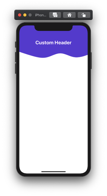
In the next few sections, we’ll try to create a custom header background that has a bottom border in the form of a wave, as shown below:
Start by creating a new screen component inside the src/screens/ScreenOne.js file that displays a heading on the screen. (Create the directory if it doesn't exist.)
Add the following code snippet to theScreenOne.js file:
Next, go to the App.js file and modify it to render the ScreenOne functional component, as shown below.
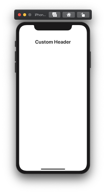
Lastly, to see this simple header text on a device’s screen, from the terminal window, execute the command expo start. You should results similar to the screenshot below:
Create a custom header component with waves
In this section, we’ll add a custom header using the SVG component in the background in the ScreenOne.js file.
The SVG component that we are going to create will wrap the Path drawing primitive. This primitive is the outline of a shape that can be filled or stroked. It primitive is represented by the Path component from react-native-svg and makes use of different commands such as elliptical Arc, moveto, lineto, and so on. You can read more about paths here.
To generate the SVG background, as we saw in the previous section, I’m going to make use of getwaves.io. This web tool allows you to generate custom wave patterns in SVG format. Check out their website—it’s simple and fulfills its purpose nicely. You can create different patterns using this tool, as well.
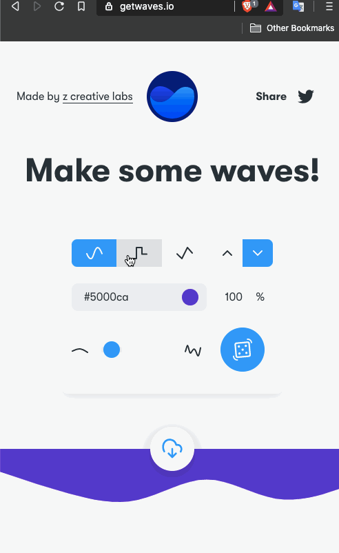
Make sure to copy the values of properties such as viewbox and d, as shown above.
Next, create a file called WavyHeader.js inside the src/components/ directory. Import the following statements:
Create a functional component called WavyHeader that’s going to have a prop passed from the parent (the screen component). Let’s call this prop customStyles. The main reason to pass this prop here is to define the dimensions of the screen component in its own file and keep the style value dynamic for different screens.
Here’s the complete code snippet for this custom component. Notice the properties of the Path component are the same as copied from getwaves.io.
Now, go back to the ScreenOne.js file and import this custom component after the rest of the import statements:
Add this component before the <View> that represents the headerContainer:
Lastly, define the style reference svgCurve in the StyleSheet object, as shown in the snippet below:
From the snippet, notice that using the Dimensions API from react-native, we get the width of the current window. The position property is set to absolute such that the header component that contains the heading is displayed and doesn’t hide behind this wavy background.
The final result should look like this:
Make the WavyHeader component reusable
So far, we’ve completed the task of displaying the wavy header background on a screen component. But what if the scenario changes and you have two screens, both requiring wavy header backgrounds but with some customizations, such as different heights or wave patterns?
In this section, let’s customize the WavyHeader component to accept more props so we can make it reusable.
First, let’s customize the WavyHeader.js file to accept more props:
Now the<Path /> component is going to accept values (such as backgroundColor, height) in the form of props passed to the WavyHeader component.
Next, go to the ScreenOne.js file and pass in the prop values for the WavyHeader component:
You won’t see a difference in the result on the device’s screen unless you change the values of these props.
Conclusion
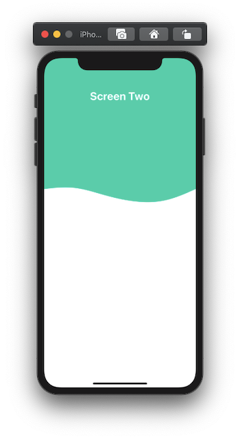
You can try adding more custom screens with different wave patterns, or try reusing the WavyHeader component for different screens. Here’s an example below that displays two different screens with different wave patterns, as well as different background colors and heights.
You can find the complete code for this post at this GitHub repo. Or try using an Expo client here.
Or check out Leandro Favre’s Whicecream example based on this tutorial!
Here is the list of resources used in order to create this post:
💙 To learn more about React Native, check out these resources:
Editor’s Note: Heartbeat is a contributor-driven online publication and community dedicated to providing premier educational resources for data science, machine learning, and deep learning practitioners. We’re committed to supporting and inspiring developers and engineers from all walks of life.
Editorially independent, Heartbeat is sponsored and published by Comet, an MLOps platform that enables data scientists & ML teams to track, compare, explain, & optimize their experiments. We pay our contributors, and we don’t sell ads.
If you’d like to contribute, head on over to our call for contributors. You can also sign up to receive our weekly newsletters (Deep Learning Weekly and the Comet Newsletter), join us on Slack, and follow Comet on Twitter and LinkedIn for resources, events, and much more that will help you build better ML models, faster.

