Exploratory data analysis: Data characteristics and visualizations

One of the most challenging questions data scientists face is how data can bring value to a specific problem. Before jumping directly into solving a problem using machine learning and AI, it’s important to decide whether that problem is solvable or not.
And to decide this, data analytics comes into the picture. Having the proper insights on your data helps you to obtain the confidence to know that you are ready to engage a machine learning algorithm, hence making it easier to find out the best way to tackle the given problem.
Exploratory Data Analysis (EDA) is an approach for data analysis that employs a variety of techniques to maximize insights into a dataset; uncover the underlying structure; extract important variables; detect outliers and anomalies; develop parsimonious models; and determine optimal factor settings.

EDA explained using a simple Dataset:
To explain EDA, I’ve used the example of the Iris dataset, which is available here (UCI Machine Learning Repository).
Objective: Classify a new flower as belonging to one of the 3 classes given the 4 features in the Iris dataset.
Let’s get started and try to get as many insights as possible!
Note: Always keep in mind the objective of data analysis.
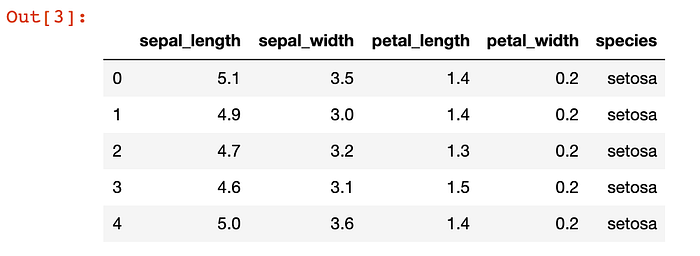
To start, I’ve imported necessary libraries like Pandas, Matplotlib, etc. and loaded the dataset.
The inferences that I’ve extracted from observing the data are mentioned in the bullet points.


- The
.head()function of the Pandas library can be used to observe the dataset as it returns the first five observations. Similarly.tail()returns the last five observations of the dataset.

The.shape can be used to show the shape (rows and columns) of the dataset.
- The Iris dataset has 150 rows (observations) and 5 columns (characteristics).

The.info() gives us information about the type of data in each column.
- Data has only float and object value types.
- No variable/columns contains null/missing value.

- The
.columns()function on the dataset can be used to get the names of the columns.

- The
.value_count()on any particular column of the dataset can be used to get the count of each value of that column in descending order. - Here, each of the species (i.e. Versicolor, Setosa, and Virginica) has 50 observations of their type, and hence the dataset is uniformly distributed.


- The
describe()function in Pandas is very handy in getting various summary statistics. This function returns the count, mean, standard deviation, minimum, and maximum values and the quantiles of the data.
So now we have gotten a good glimpse of the data. But do you think it’s enough 🤔? Let’s now explore 👀 the data with the help of a few visualizations to help reach more conclusions. Python has a visualization library, Seaborn, which is built on the top of Matplotlib. It provides very attractive and informative statistical graphs in order to perform both univariate and multivariate analysis.
Note: Make sure you’ve already imported Seaborn.
2-D Scatter Plot
A scatter plot is a type of plot that shows the data as a collection of points. The position of a point depends on its two-dimensional value, where each value is a position on either the horizontal or vertical dimension.

The FacetGrid class in Seaborn helps in visualizing the distribution of one variable, as well as the relationship between multiple variables separately, within subsets of your dataset using multiple panels. Here the ‘hue’ parameter separates the data points on the basis of the color related to each parameter.
The points of the 3 classes are scattered according to their sepal_length.
- Using
sepal_lengthandsepal_widthfeatures, we can distinguish Setosa flowers from others (linearly separable). - Separating Versicolor from Virginica is much harder, as they have considerable overlap.
Pairs Plot
A pairs plot allows us to see both the distribution of single variables and relationships between two variables.


petal_lengthandpetal_widthare the most useful features to identify various flower types.- While Setosa can be easily identified (linearly separable), Virginica and Versicolor have some overlap (almost linearly separable).
- We can find “lines” and “if-else” conditions to build a simple model to classify the flower types.
Histogram and PDF (Probability Density Functions)
(1D-Scatter Plot)

The distplot() function is used to plot the distribution plot of the petal_length of various species. Blue color represents the histograms of the petal_length of Setosa flower, and so on. The y-axis represents the counts/number of points that exist in a small window/interval on the x-axis, which means given a point/region on the x-axis, the height of the histogram represents how many points exist in the small window for that particular value of petal_length.
The greater the height of the histogram (denser is the region between a given interval), the more the species found correspond to that value of the petal_length. The above plot, therefore, is also called a density plot. The curved lines above, made by smoothing the histograms (using KDE), are the PDF (Probability Density Functions).
Conclusions:
- if
petal_lengthis ≤ 2, species is Setosa. - if
petal_lengthis >2 andpetal_lengthis ≤4.7 (threshold), then species is Versicolor. - if
petal_lengthis ≥4.7, then species is Virginica. - This shows us that univariate analysis using
petal_lengthcan be a helpful feature in classifying the species. Using just one feature, we can build a simple “model” using if/else statements.
Note: I’ve chosen 4.7 as a threshold and not 5 because if we have a flower whose
petal_lengthis ≤4.7, the chances of the flower species being Versicolor is higher than Virginica.
You can also complete the univariate analysis using petal_width, sepal_length, and sepal_width, but you’ll probably come to the conclusion that petal_length is a better predictive feature than all of these mentioned above 😅.
The limitation of PDF is that we cannot view charts or statistics on them. For instance, we cannot say what percentage of Versicolor points/species have a petal_length of less than 5.
And for this reason, we use CDF (Cumulative Distribution Function).
CDF (Cumulative Distribution Function)
The cumulative distribution function (CDF) calculates the cumulative probability for a given x-value. We can use CDF to determine the probability that a random observation that’s taken from the population will be less than or equal to a certain value.
Advantage of CDF: We can visually see what percentage of Setosa flowers have a petal_length of less than 1.6, as one example. PDF and histograms do not give us the exact percentage for the same. They are just distribution plots.

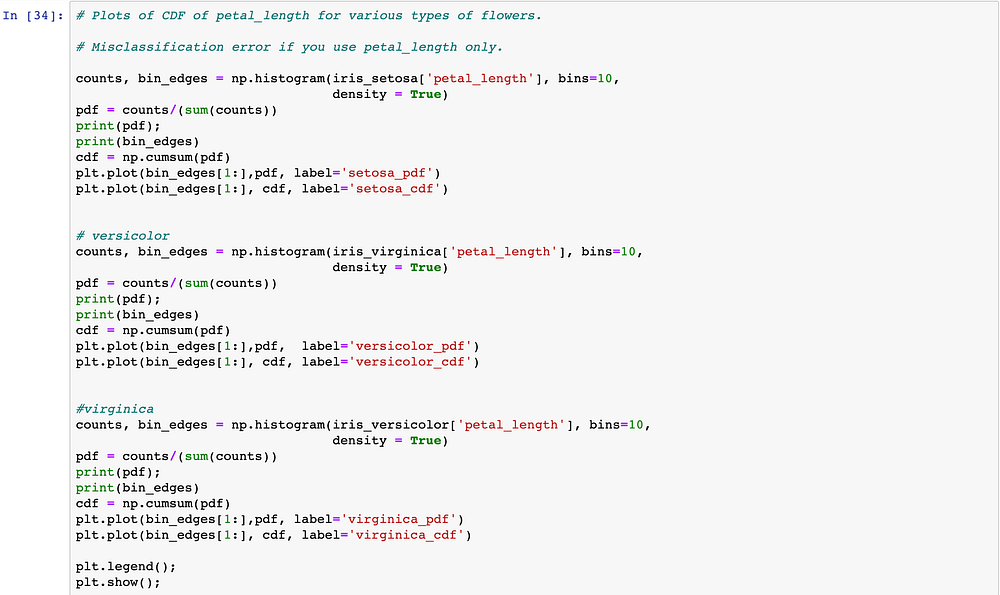
We’ve made 3 different data frames corresponding to each species category. The x-axis in the above graph represents petal_length. The y-axis represents the probabilities (between 0 and 1) for the same.
The cumsum() function in NumPy is used to build CDF from PDF.
The bin_edges, counts, and bin are used in building a histogram and PDF for a given data.
- Let’s take the
petal_lengthas 1.6. For 1.6, we have ~82% (.82) of Setosa flowers that havepetal_lengththat’s ≤ 1.6. This means that out of a total of 50 Setosa flowers, approx. 41 flowers havepetal_lengththat’s ≤ 1.6. - All Setosa flowers have
petal_lengththat’s ≤ 1.9.
Let’s look at the CDF for all three flowers in a single graph:


We can conclude the following:
- If
petal_lengthis ≤ 2, the flower species is Setosa. And the accuracy of the above statement is 100%.
2. If petal_length is > 2 and petal_length is ≤ 5:
- the flower species is Virginica. And hence, the accuracy by which we are classifying a species into Virginica is about 95 % (95 is the value of CDF of Virginica at
petal_length= 5 and hence 95% of Virginica species havepetal_length<=5) because 5% of the Virginica species havepetal_length>5. - or, the flower species is Versicolor. And by saying this, the accuracy by which we are classifying a species into Versicolor is about 10% (10 is the value of CDF of Versicolor at
petal_length= 5 ) and 90% of the times our prediction in this category would be wrong.
3. When petal_length lies between 5 and 7 and if here we classify a species as Versicolor, the probability of predicting it correctly is 90%. (10% of species have petal_length ≤5)
Box-and-Whisker Plots
A box plot (or box-and-whisker plot) shows the distribution of quantitative data in a way that facilitates comparisons between variables. The box shows the quartiles of the dataset while the whiskers extend to show the rest of the distribution.
The box-and-whisker plot is a standardized way of displaying the distribution of data based on the following five-number summary:
- Minimum
- First quartile
- Median
- Third quartile
- Maximum
In a simple box plot, the central rectangle spans the first quartile to the third quartile (the interquartile range or IQR).


At this point, having employed these analytical and visualization techniques, you should have a pretty good sense of this particular dataset. Kudos 🎉 🎉
After doing EDA, you can begin with next steps: data cleaning, preprocessing, implementing various ML Algorithms, and building a working model with the dataset! All the best :D
You can see my Jupyter notebook here and play around with different approaches. For example, you could try out a pairs plot by taking different features and sharing the inferences you could make from them.
If I missed out on any useful information that could have been derived from the dataset, feel free to leave it in a comment 💬 below.
GitHub Repository link:
Thanks for reading! If you enjoyed this story, please click the 👏 button and share it to help others find it!
Have feedback? Let’s connect on Twitter.
Editor’s Note: Heartbeat is a contributor-driven online publication and community dedicated to providing premier educational resources for data science, machine learning, and deep learning practitioners. We’re committed to supporting and inspiring developers and engineers from all walks of life.
Editorially independent, Heartbeat is sponsored and published by Comet, an MLOps platform that enables data scientists & ML teams to track, compare, explain, & optimize their experiments. We pay our contributors, and we don’t sell ads.
If you’d like to contribute, head on over to our call for contributors. You can also sign up to receive our weekly newsletters (Deep Learning Weekly and the Comet Newsletter), join us on Slack, and follow Comet on Twitter and LinkedIn for resources, events, and much more that will help you build better ML models, faster.

