Data Visualization
How to Render Huge Datasets in Python through Datashader
An overview of the Datashader Python Library, with a practical use-case

Datashader is a completely open-source Python library that permits the visualization of huge datasets. As part of the HoloViz family, Datashader can be used as a standalone library, or in combination with the other tools provided by DataViz, to solve complex visualization tasks.
Datashader can be used whenever a huge dataset (i.e. millions of records) should be represented visually, either in a map or in a generic plot. Instead, it is not indicated when the dataset is small (thousands of records).
Many other Python libraries exist for Data Visualization, including matplotlib, seaborn, bokeh, and so on. With respect to these libraries, Datashader is faster when rendering huge datasets. Indeed, through the Holoviews library, Datashader can be used in combination with some of them.
To build complex graphs from huge datasets, Datashader breaks a complex image into several intermediate representations which are combined for the final rendering.
In this article, you’ll learn:
- An overview of Datashader.
- How to combine Datashader with other tools.
- A practical use-case.
Overview of Datashader
Datashader renders the whole dataset into a pixel buffer and defines a fixed-size image, which contains only the data current visible. This strategy allows you to build graphs very quickly.
To render a graph, the following steps are involved:
- Load data from a source file
- Set up the scene
- Aggregate data
- Plot data
Load Data
Datashader supports different data formats, including dataframes in Pandas or Dask, multidimensional arrays in xarray or CuPy, columnar data in cuDF, and ragged arrays in SpatialPandas.
Setup the Scene
A scene is a 2D rectangular grid representing the area where the plot will be drawn. A Canvas is used to set up the scene:
import datashader as dscanvas = ds.Canvas(plot_width=400, plot_height=400,
                   x_range=(-10,10), y_range=(-10,10),
                   x_axis_type='linear', y_axis_type='linear')
The canvas object receives some plot configuration parameters, such as the plot width and height (plot_width and plot_height), and the type of axis, linear or logarithmic (x_axis_type and y_axis_type). Additionally, a range for the axes can be defined (x_range and y_range).
Aggregate Data
Once the scene is set up, all data points are aggregated into that set of bins. In the whole chain of rendering steps, only aggregation requires access to data, thus requiring the greatest computation effort.
Datashader provides the following basic plot types (glyphs):
- Point
- Line
- Area
- Trimesh (triangle)
- Quadmesh (quadrilateral)
- Polygon
- Raster (regularly spaced axis-aligned rectangles)
For each glyph, data must include different information. For example, for a point, only x and y coordinates must be provided, while a trimesh requires also the z coordinate, in addition to x and y.
Datashader also includes other plot types, such as network graphs and time series, as well as customized plots. For more details, please refer to the documentation.
For example, all the points in a dataset can be plotted as follows:
aggregation = canvas.points(df, 'x', 'y')Where, df is the dataset, x and y are the coordinates of the points. Optionally, another parameter can be added, corresponding to the reduction operator to be used when aggregating multiple data points into a given pixel.
Among the many reduction operators defined by Datashader, the following ones can be used as a starting point:
- Count — For every bin, count all the data points contained in it.
- Any — The bin is set to 1 if at least one data point maps to it, and 0 otherwise.
For example, the count reduction operator can be used as follows:
aggregation = canvas.points(df, 'x', 'y', agg=ds.count())Plot Data
Finally, data can be plotted through the ds.ts.shade() function. Three main parameters can be defined:
- How — Specify the transformation function, which renders bins. Datashader provides different functions, such as linear and logarithmic. For more details, please refer to the documentation;
- cmap — Define the colormap to be used to render bins. The colormap can be specified manually or using an existing one, such as those provided by the colorcet library.
- Span — Focus only on a subset of aggregated data.
For example, a linear plot with a fire colormap could be specified as follows:
import colorcet as cc
plot = ds.tf.shade(aggregation, how='linear',cmap=cc.fire)
Optionally, the image background can be set:
ds.tf.set_background(plot, "black")The produced image can be saved as a separate png file as follows:
from datashader.utils import export_image
export_image(plot,"my_image", export_path=".")
Combine Datashader With Other Tools
Datashader can be combined with the other tools of the HoloViz family, for example, to build interactive graphs. In practice, the datashader plot can be embedded into an external wrapper, such as Plotly or bokeh, which provides interactivity.
For example, to represent data points into an interactive map, three steps are needed.
- Environment Set up
- Define the wrapper (map)
- Draw points in the wrapper
Environment Setup
Firstly, the HoloView library must be imported. If it is not already installed, it can be installed through pip:
pip3 install holoviewsThen, the plotting library must be specified, e.g. bokeh:
import holoviews as hv
hv.extension('bokeh')
Define the Wrapper
The wrapper is the container for the Datashader image. A tile is an example of a wrapper. Holoviews support different types of tiles, as described in the official documentation.
To create a new tile, simply, import the selected class in the workspace and create a new object by also specifying the map size (width and height):
from holoviews.element.tiles import CartoLightmap_tiles = CartoLight().opts(width=500, height=500)
Draw Points in the Wrapper
Finally, the Datashader map can be drawn. At the moment, a subpackage of the holoviews package must be used (i.e. holoviews.operation.datashader), instead of the original datashader package.
Firstly, the graph is plotted:
from holoviews.operation.datashader import datashadeaggregation = hv.Points(df, ['x', 'y'])
plot = datashade(aggregation, cmap=cc.fire, width=500, height=500)
The graph is combined with the map tiles:
final_map = map_tiles * plotFinally, I save the map to an HTML file:
hv.save(final_map, 'output.html', backend='bokeh')Use Case
As a practical use case, I use Datashader to plot a world map with all the localities in the world, with the aim of visualizing countries with the greatest number of localities.
In this example, I exploit the Geonames dataset in the version provided by Kaggle. The Geonames dataset contains over 10 million geographical localities, distributed all over the world.
In this example, I plot the dataset, firstly as a static image, and then in a geographical map.
Starting with a solid dataset can streamline your ML experiment process. Learn what to look for and how an overall MLOps strategy can mitigate pain points with our free webinar.
Load Dataset
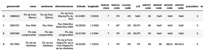
Assuming that the dataset is located in the source directory, I load it as a pandas dataframe.
import pandas as pddf = pd.read_csv('source/geonames.csv')
df.head()
I calculate the size of the dataset.
df.shapeWhich gives the following output:
(11061987, 19)The idea is to group data points according to thefeature class they belong to. Thus, I get some information on the feature class column.
df['feature class'].value_counts()Which returns the following output:
P    4512258
S    2129266
H    2068348
T    1507935
L     384854
A     357415
V      44679
R      38169
U      14491
Name: feature class, dtype: int64
And I convert the column values to type category.
df["feature class"]=df["feature class"].astype("category")Build a Static Graph
Firstly, I define two variables, specifying the height and width of the graph.
height = 300
width = 600
Then I set up the scene by defining the canvas.
import datashader as dscanvas = ds.Canvas(plot_width=width, plot_height=height)
Now, I build the aggregation, also specifying the reduction operator. Note that I exploit the ds.by() reduction operator, which requires the categorical column, as well as the aggregation criteria (ds.count() in my case).
aggregation = canvas.points(df, 'longitude', 'latitude', agg=ds.by('feature class', ds.count()))Finally, I draw the graph.
import colorcet as ccplot = ds.tf.shade(aggregation, cmap=cc.fire)plot

Eventually, I save the graph.
from datashader.utils import export_imageexport_image(plot,"geonames_map", export_path=".")
Build an Interactive Graph
I build an interactive map, through holoviews. Firstly I import the package and I set the bokeh extension.
import holoviews as hvhv.extension('bokeh')
Now, I build the map tiles. Note that I specify the wheel_zoom as an active tool of the map.
from holoviews.element.tiles import CartoLightmap_tiles = CartoLight().opts(width=width, height=height,active_tools=['wheel_zoom'])
I draw the image.
from holoviews.operation.datashader import datashadeaggregation = hv.Points(df, ['longitude', 'latitude'])
plot = datashade(aggregation, cmap=cc.fire, width=width, height=height)
And I combine it with the map tiles.
final_map = map_tiles * plot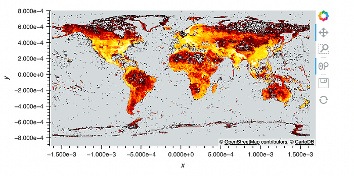
Finally, I save the map as an HTML file.
hv.save(final_map, 'output.html', backend='bokeh')Summary
Congratulations! You have just learned how to plot a graph in Datashader! With Datashader you can represent big data into a single graph, and do so very quickly.
This article does not cover all the features provided by Datashader, thus you can refer to the references of this article, which include the Datashader official documentation.
All the code of the use case can be downloaded from my Github repository.
References
Editor’s Note: Heartbeat is a contributor-driven online publication and community dedicated to providing premier educational resources for data science, machine learning, and deep learning practitioners. We’re committed to supporting and inspiring developers and engineers from all walks of life.
Editorially independent, Heartbeat is sponsored and published by Comet, an MLOps platform that enables data scientists & ML teams to track, compare, explain, & optimize their experiments. We pay our contributors, and we don’t sell ads.
If you’d like to contribute, head on over to our call for contributors. You can also sign up to receive our weekly newsletters (Deep Learning Weekly and the Comet Newsletter), join us on Slack, and follow Comet on Twitter and LinkedIn for resources, events, and much more that will help you build better ML models, faster.